Website powered by

Theatre Environment Development part 14 Evaluation

General / 18 January 2021

This project has been a long and arduous journey. I've learned a lot of practices that artists use, thought processes that artists go through during their workflow and things that I have need to address as an artist myself. In the past several months I have been taught different techniques like master materials, Niagara FX, channel masking and more. This has been a real challenge for me to create a large high-level environment. elements like taking things such as the levels layout into consideration to tell a story, were brand new concepts for me. This project was a real gauntlet to test and grow my skills and in this post I will be evaluating the final outcome of my level and how well I’ve grown as an artist and what I should do to improve my skills from here.
  

One thing I am certain of from this project is that I have vastly improved upon my texture work and consideration when working with texture sets. From what I have been taught over the past number of months, I have learned to add more than just add a material and detail it manually, but instead, create complex layers of materials that bring out the best in the model. Things like anchor points and PBR Validate help me with metallic surfaces and the values involved. I can now create interesting and unique texture sets using techniques taught to me through the course and artists that have generously given use their time to demonstrate their skills
  

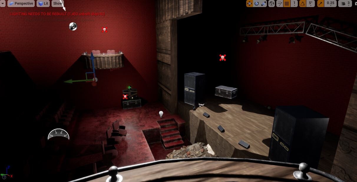
Over the more recent weeks I felt that my environment is lacking. At times I felt proud of my progress but looking back I feel like I should have done more and went in a different direction. The small and rather bland environment limited my thought process and what I could have done with this environment. As the project went on, I found myself thinking of other ideas I could have went through but felt that I was too deep to go back and rebuild. I believe my two main weaknesses for this project were my stubbornness to go with a single idea in the beginning and my time management. From the start I had an idea in mind and stuck with it, without considering multiple concepts and broadening my choices and directions I could go with. This goes together with my time management skills because if I had managed myself and my time more effectively, I may have been able to rework my environment to suit more creative ideas. The next large scale project I do I will go in with a broader mindset and put in more prep work so that I can achieve a greater result, utilising the knowledge I’ve gained over the past number of months to create a more interesting and thought provoking environment.


The main take away from this project was the experience of creating a complex environment with the idea of storytelling in mind. there are some areas across my environment I am proud of. Above is a caption of a small communal spot around a burning fire, I had imagined a small settlement of people were trying to survive in this theatre and that this spot was the main eating/relaxing area. I used mega scans of Chinese cartons to suggest that this is where they sit, eat, talk, and rest. The trash is piled up against the door and the cartons are spread across the floor, perhaps they had a final meal together here and left before something happened? it this kind of thought process that I wanted to bring people through for this area of the environment. Below I tried to create a first person shot of how one of them watched the stage, as if imagining a concert from years before.

Overlooking the environment, I feel a sense of pride in a large-scale project unlike anything I have done before. This project allowed me to explore a vast amount of techniques and learn so many thought process' behind prop creation and environment art. In hindsight I can see my short comings and where I need to improve myself as an artist. My personal greatest take away from this project was my newfound understanding of texture creation and application. I feel that my biggest short coming of this project was my closed mindless of what I could and wanted to do, I need to be able to think with a broader mindset and challenge myself to do better. However, in relation to the project my short coming lies within the layout or design choices. My environment seems very procedural in a lot of places and lacks elements of originality.

In the end I will learn from this project and adapt myself more going forward and as this project ends, I look forward to the next one. Thank you for reading and following my journey of this environment. Look out for the future posts on my artist profiles where all my renders will be uploaded alongside the sequencer clip, I made in Unreal Engine. Thank you for reading, until next time!

Theatre Environment Development part 13

General / 18 January 2021

This project has been a great experience for prop creation and environment design. With deadlines coming up the following weeks would become crunch time, a familiar time for many game developers. In this time, I would bring my project to a close, finishing the development of props, utilising elements within unreal engine and mega scans to build up the environment then finishing off with setting up lighting and VFX.

One of my main steps of progression was finishing my guitar prop. I used the references I had gathered at the beginning for the guitar’s material and colour scheme. I'm really happy with the end product that I was able to achieve, it’s a lot more detailed than models I textured a year ago and I feel that it’s a good display of how well I’ve grown as an artist. the aim for its design was to make it appear worn and old, while I feel that the texture helps it appear this way some minor details could be done to improve it. The strings could be more frayed at the headstock, or even some strings could have been broken or missing. However, the small details like the bridge and the frets also help it look more believable and the ambient occlusion from the bake helped with the texturing stage and emphasis the boundaries between the different parts.


After finishing up props I promptly moved onto working within unreal engine, creating splines to replace the cables I had previously used. this way I could move the props without worrying about their connection to the sockets on the walls. Other things I did included a further utilisation of mega scans for props, decals, and vegetation.


The vegetation crawls down from the hole in the ceiling and wraps around the stage wall and the ceiling lights, creating the idea that the building has been unkept for years, allowing vegetation to grow around the building and slowly spread.


The next stage of my environment’s development was the use of Niagara FX. This system projects images to create visual effects, I used it to create dust and rain effects. The dust particle float freely throughout the environment and the rain only falls through a small radius approximately the size of the hole in the roof. These were to help with the final renders of the scene, subtle details that help build the world. When creating the dust, I made it so that the small sprites would slowly come in and out of a certain space, following a twisting pattern like how wind would blow the small dust mites through the air. I made the rain fall heavily, to exaggerate its presence.


Next, I started to add and build variations of lights and lighting combinations. Each section of the environment has a unique light to it to help it seem more distinct, the "no future" door had a light function flickering across the wall decal and roadiebox. The stage had the skylight and god rays, while the far right had the oil drum fire. The lighting is meant to both compliment the layout of the props while also drawing in the attention to that area, to help the lighting accomplish this I added a thin layer of fog so that the lighting could be more pronounced. after building the lighting I asked some people for their opinion on the lighting, feeling that it was too dark. They agreed and gave me some pointers such as increasing the intensity of the lights, decrease the density of the fog, add more lights, and turn up the world space lighting value.


Taking their critiques on board I increased the world space lighting value and decreased the fog density value. this way the props I had made were more visible and the fog only emphasise the lighting without obscuring the view of the environment through the fog. The environment looks a lot better and the colours across the room were more vibrant. below you can see the light reflecting of more surfaces and spreading further than before, alongside the subtle rays of light from the lowered fog levels.


After correcting the light levels based on the feedback I was given, I decided to move onto the screenshot and sequence set-up. these cameras would then be used to take screenshots or then be used for the sequencer of the environment after the project was built using high end settings for the light building. The Unreal engine sequencer tool allowed me to manipulate cameras, their draw distance and focus', etc. this would help create an interesting clip showing off the environment.


Once the environment was built, I used these cameras to make flattering shots and views of the environment. Here are a couple of previews, the entirety of the screenshots and the sequencer video will be posted later this week across my artist profiles online.

This blog post was made to outline some of the final processes I went through before the end of this project which I will be evaluating through a separate post. In it I will be discussing areas I am proud of and areas that I believe I should have done better in.


Theatre Environment Development Part 12

General / 04 January 2021

Prior to the new year’s break, I had begun to flesh out my environment but mentioned where I was unsatisfied and what elements I wanted to revisit once we started back up in class. Here's what I’ve managed to do within the last few days after the new years.

To start off, I had mentioned at how procedural my environment looked. Below is a quick demonstration of how I tried to make a small but interesting scene using the assets that were already within the project. I tried to make it look like that they were attempting to barricade the door using tools and objects from around the theatre. It’s a small point of interest and when I move onto the final stages of lighting and rendering, I’ll have to think of a way to direct attention to this space and help it provoke thoughts about its design.


Moving on, I had also determined that the ceiling and the stages front wall were not to my presences. I revisited the front walls mesh and created a better replica of broken stone for the top. The wall is a placeholder for now as I want to use Zbrush so the surface where the wall is broken matches the large piece of rubble, I started in Zbrush. I will also be adding some rebars to match with it too.
The hole in the ceiling was also made smaller, previously it was bigger than the gap of the front wall and didn't look right. After making it smaller it looked better and I tried using a new material for the ceiling too. I'll be posting these images in my group chat, but all feedback is welcome here too. Before I add vegetation, I’ll add some planks of wood or a wooden beam so that when I do add vegetation it can grow down of it. 


Another factor I played around with was the layout of my debris elements and mixing them with the mega scans to help bridge them together and help the mega scan seem more fitting within my environment. When it is complete the large piece of rubble will sit in this pile as well, mixed with the wooden debris of the ceiling. I added bricks to nearby areas too to help reinforce the spread of the damage.
A subtle touch I added was weeds growing from the pile of dirt and rock, weeds are versatile plants and can grow almost anywhere a thought they were more suitable than flowers or other vibrant plants.


Finally, I created more props to help make the theatre look better. Before Christmas I felt that there were some elements that were missing that helped it feel more real.
You can see below I added a more major prop and some smaller ones. The front lights for the stage hang from a pole that the wires are fed through, then out the end through a plastic tube.
I added a couple of sockets and wires for the speaker but when I imported them into unreal they were thinner than I had anticipated, so while I’m finishing up on props within the next few days I’ll return to them and fix them too.


Finally, I worked with actors and creating a light function to finish up the oil pit. The method I used, from following a video on YouTube, consist of using a sprite sheet and an emissive node to create a small fire. That along with using a point light within the actor with a personalised light function I got this flickering flame. While this works for now, I'd rather experiment with the use of Niagara to create an emissive fire rather than an emissive actor.


Theatre Environment Development Part 11

General / 04 January 2021

Prior to Christmas I had a large majority of my environment completed. At this point I had approximately 25 or so of my props incorporated into the environment. These are shots taken before I went on Christmas break where I tried to get as many elements incorporated into it so that I could enjoy my holidays. Below I demonstrate some of the methods or ideas used within game development industries. Over the Christmas break I’ll re-evaluate my design choices, elements that are missing or factors that need to be touched upon.

This shot from the balcony gives a good view of the stage and a decent look into a more organic layout, suggesting that people have been frequenting this building despite that it's in ruins. I used several lights to help make the environment more visible for these shots, they also acted as good guides for the values of different materials across the environment.

I took a variety of shots across the environment, imagining that they were being taken by a person. From the stage you get a good view across the theatre, however, I found that using the trim sheet texture on the ceiling was more jarring than fitting. The protrusions don't make much sense across the ceiling so after Christmas I’ll be revisiting this element to make it more suitable.

Like the ceiling I tried to use the trim sheet texture on the front wall of the stage. It looks decent enough, but it may be another element that I revisit after the holidays.

Before I finished up for Christmas, I explored some lighting applications and industry practices. I wanted to recreate a fire for the oil drum and the soft glow of the emergency exit sign, so I used point lights as place holders and references for the future.
Afterwards, I tried using some mega scans from the unreal library. I used a debris pack to add elements like rubble and scattered rocks and dust as well as some light vegetation within the rubble underneath the skylight in the ceiling.


To help flesh out the environment and fill it up I imported several models and experimented with their layouts. There were some issues with scale and layout. By the end of this session I was happy with how the assets looked within the environment but found the layout I had wasn't very impactful. There were also simple elements that I felt it was missing, like plugs, sockets, wires, etc. After Christmas I’ll focus on these missing elements and other details that are missing from the environment.


Theatre Environment Development 10

General / 03 December 2020

Environment Development

This week, it was brought to our attention that we couldn't light up our scenes without having the larger portions of them textured. My focus this week was a start to the texturing of the environment and to use some new techniques across the environment too. Below are quick glances of how the environment looks with these new textures added to larger meshes. I'll go more in-depth after these Gifs, briefly discussing methods I used.


I'll start of by addressing some improved aspects of the environment, primarily the addition of colour and a breakup of proceduralism. So far, it’s a vast improvement from the typical grayscale tiling it was before and the layout of the chairs is better, they aren't as crowded together and spaced out correctly. However, the material doesn't look too detailed and quite flat. The material for the floor also contradicts the colours of the seats, with the seats lacking a similar level of saturation. Attention to the floor’s material is required, to help define the edges of the chairs better and the chairs should be brightened up to match the surrounding environment.


Something else I did was implement the use of the Trim sheets I made before, to help create a sense of reoccurrence of design across the environment. I planned to use it on the balconies from the beginning, but after applying them to the environment I feel that I could use them on a trim board that goes around the theatre.


For now, the environment can now be used to create good lighting ideas on how it will be lit by end. However, I came across some issues I need to sort out by the time this project ends, and I plan to address them in this coming week.

The first issue I came across was the scale of the brickwork across the different walls. To fix this I’ll either make the walls all one object or fix the scale of one wall to match the others.


In substance painter the materials looked less glossy, but when I imported them into unreal their surfaces were very smooth, and the sky light made bright glares from their surfaces. This was more jarring on the red plastic flooring as the steps beside it were more matte in appearance and the wooden material was less glossy in substance designer. These issues may have arrived from not utilising the light tool when making either material, or from the roughness values being left too high for either material.


Moving on from the environments design, I tried to make a new prop for the environment and experiment with making a beauty render of props I made earlier. To stick with the idea that the theatre was abandoned during a concert I wanted to make a prop related to stage management, which led me to making this Sack Truck. It was my first time trying to make a tire too, the angular edges make it obvious when you look closer but from a distance it looks alright. the paint on the steel and the areas of rust make it look more authentic and worn down. I feel that its colour fits in with the values and appearances of the other tool props. The obvious improvement for this prop is the smoothness of the tires and fixing the threads to be more appropriate to the size of the object.


Theatre Environment Development 9

General / 25 November 2020

Week of personnal catch up

This week we had no new material to learn, this gave us an opportunity to get some of our environmental props up to date.  I took this past week to update the textures of some of my older props, fix issues like topology and their finishes.  Below are some of the textures i updated to look better and less amateurish. I made use of different materials and smart masks to create some interesting surfaces. I also smoothed out the model for the theatre chair and bake a mid poly version onto the low poly, then updated the materials and added a better dirt layer and it looks far better than before.


After I fixed up and finished these textures, I started to work on some other props to build up more of the environment. I made this balcony, a plank and a brick. The latter two are for piles of debris and areas of damage. The balcony is one of two I have planned, with the other being broken or in ruins.


To finish off the week, I imported the models and the textures into the unreal project. The textures look good in the natural lighting, so the material values seem to be correct. as I tried to place the objects within the project, I attempted to place them in an organic layout, as if they were in the final layout. some elements I will address include; the broken tables scale, an addition of variety to the candles and finished textures to more medium/large props to start filling the environment with colour and help flesh it out more. Next week I will be looking at lighting up the environment, adding more major colour changes to the environment will benefit this for sure.


Theatre Environment Development part 8

General / 19 November 2020

Trim Sheets

Another new technique I’ve explored is Trim Sheets.  To learn how to make one and where it can be used, I followed a YouTube tutorial made by the Polygon Academy channel. I took liberties with its design, basing them off references I gathered from online.


I thought that I could use this trim sheet for the front of the stage and the balconies of the theatre. When gathering references, I looked for more modern theatres because of the theme of my environment and the story I want to tell through it. I really liked the protrusions that were shown in the videos, as well as the wooden panels from a theatre I had in my reference board. For my first attempt, I also didn't want to go overboard with the design of the trim sheet, so I left spaces for decals to be added in Zbrush.  The extrusions were made by connecting the left and right edges to half the plain mesh. I did this and separated the plain mesh into 5 separate plains and named them A-E as they would have different designs.


Once the model was made I added creases to certain edges so that when I added subdivisions in Zbrush these parts would retain their shape and allow me to add details without drastically changing the overall form of the mesh. For the same reason I added more edges to the main mesh from top to bottom and created square or rectangular faces across the surface. Before exporting the mesh as an OBJ I smoothed it, so that I wouldn't have to add as many subdivisions in Zbrush. I then exported each section as separate meshes and named them as I had in the outliner.


To import the models, I started by importing the base in the subtool menu and drew it out within the Zbrush viewport.

A handy trick shown in the video was to import the rest of the models through the Subtool Master and choosing the MultiAppend option, to then select the other panel parts. They imported in the same positions as they appeared in Maya, this is because they retained their global positioning from Maya. This was so much easier than importing them independently and positioning them manually.

After Zbrush had imported the model I needed to subdivide each part, without smoothing. To do this I selected each part in the subtool tab and then turned off the smt tab followed by adding subdivisions. After I had around 1 million active points on the subtool I activated the smt tab again.


To add edge wear and detail, the video recommended this brush to bevel the edges. I used it to make the wood seem warped and worn. I used the brush along the edges of the areas that protruded from the plain to help suggest this idea. I used various levels of intensity to add variation along the edges and avoid uniformity across the design.

This was the mesh by the end, the longer panels look well-worn and while the smaller ones have bevels, it doesn't look as worn as the other panels of wood.  Next time I should try to use a stronger level of intensity to warp the panels more.


Next, I wanted to add more details that would make the mesh more interesting and give them a level of uniqueness. But the main issue with this is having a pattern that could loop and not cause seams when repeated across a surface. The tutorial series went over how to create a straight stroke and allow the added decal to be looped.

By activating the Lazy Mouse function and turning on; Backtrack, SnapToTrack and Line. When I tried to draw on the mesh an icon showed up along with a ruler line as I dragged away from the first click. The pattern then started to appear along the ruler line as I dragged the mouse back to the point where I originally clicked.


I used this technique to add basic yet fitting patterns across the separate Subtool. The idea for having the patterns on the larger areas of the panels came from a design in  one of my references, they also help add a unique appearance to them, however, there’s very little area of rest so the surface is too much going on. Next time I make a trim sheet I should hold back on the decal and use the empty space more effectively.

By the end, this was my final design for my trim sheet. When I was happy with, I went into the Zpluggin tab and down to the SubTool Master to export it from there, so that it exports all the parts at once as an OBJ to use in Maya again.


Now that the high poly was in Maya, I had to reorganise parts of it so that it could loop or tile. For the plains it meant duplicating them and lining them up on either side. By doing this I could avoid bad seams and see if the decals successfully looped, which they did. If they didn't, it would be an issue I would have had to fix using photoshop.

For the protrusions on the lower half I had to delete the right-most one and replace it with the far left one, so that it would connect correctly on both ends. I also recreated the flat plain mesh from the start to bake the high poly onto. I exported all these parts as FBX files to use for baking in substance painter.


I opened the flat plain and baked the high poly mesh onto it, the results were great for my first attempt and because I followed the advice form the online tutorial. The next stages involved a simple substance material workflow of adding smart materials and creating a layer of dirt too, I won't go too deep into detail because I have went through this process before and don't do anything new until after the materials are set.


I went for a simple dark wood material to make it look older, as well as using darker values for the dust masking.  By changing the values of the smart mask and material I could experiment with different values until I was happy with the appearance. Ultimately, I went with a low level of dust that concentrated around joints. I had planned for this trim sheet to be used for vertical surfaces, so a grunge that replicated a water damage effect could have been added. However, the tutorial said that if the trim sheet was applied to a different type of mesh, details like that could stretch and ruin the overall value of the trim sheet.


The final test, before I export the textures for Unreal, was to see if the material and mesh tiled correctly. With the flat plain mesh from earlier I replicated the length of the high poly from earlier and exported it as an FBX. I then went into the edit tab of substance painter and brought up the project configuration menu and selected the longer version of the low poly model. This applied the bake across the plains and successfully tiled across all three.

The decal runs across properly and doesn't leave any bad seams where the tiles would meet, and neither do any of the protrusions and trims. Since the trim sheet was working well, I set the low poly mesh back to the original and renamed the material to Trim_Sheet_01A. This was recommended because if I use this method while working with a team, my team could take this trim sheet and make variations and name them B, C, D, etc.  After naming it I exported it as Unreal Packed.


Importing and making this material was easier than materials before and only required the 3 maps. After they were imported, I made a new material and plugged in the necessary nodes and like that my trim sheet material was ready to be used within the unreal engine.  In hindsight, I would make better use of empty space and change the brightness of the material or darken the dust because the decals aren't as visible as I would like them to be.


Theatre Environment Development Part 7

General / 18 November 2020

Channel packing and Texture masking

Something new I explored this week was channel packing and how it can be used for texture masking, the process was new to me and I have rarely used Photoshop, so I found the experience both challenging and enriching. The first stage of the process was to assign materials to a prop, one with metallic values and another without them. I added the material and masked the suitable areas for each. Next, I exported the masks for both materials and the ambient occlusion map for the entire model.


I took these maps and imported them into Photoshop. I grouped them into 3 separated folders that were colour coded red, blue and green. The Ambient Occlusion, non-metallic and the metallic went into each folder respectively to help represent the influence each channel has in relation to its colour. Afterwards I double-clicked the group layer and opened its settings, in this window I changed the layers channel influence on red green or blue respective of the colour I labelled it. These channels correspond with the channels within the unreal engine and the nodes for the materials.


After changing these values, the maps changed to this brightly coloured map. This is result of packing the 3 maps into one. This is so that it can be used to change multiple values from the single node using special inputs within unreal. After the channels are packed, export the file as a PNG so that it can be imported into the unreal engine as a texture tile.

With the packed texture set in unreal, create a new material and plug it in like so. The three colour nodes are influenced by the packed texture set via the alpha input. The alpha is influenced by the channel output of the texture mask, so if the blue channel connects to the alpha the colour will change the non-metallic parts of the model. This is also the same for the metallic colour node. Both connect to the Ambient occlusion channel via the multiply node. The nodes towards the bottom were used before, for the material instance nodes. Alongside the texture mask, I can create multiple material instances from this material so that I can show variation between props and change unique properties of the materials as opposed to making them and changing them within unreal.


I created multiple instances and changed the values of the colours and the material attributes such as their metallic values or their roughness'. This could be useful for props in my environment like the chairs and the quality of the cushioning, or for things like piping and light fixtures.


Theatre Environment Development part 6

General / 12 November 2020

To start the week of right, I began development on my first hero prop. I decided to make the guitar that would sit on the centre of the stage. The first step I took was creating a reference board of guitars. I collected images of the guitar I wanted to replicate, guitars with different types of damages and worn edges and a collection of guitars with unique colour schemes and patterns that I could then implement into my guitars design. I really liked the wave patterns and bright colours but preferred the shape of the electric guitar at the bottom, so I may make a new material in substance designer for the front of the guitar. I collected the damage images for reference of surface detail and for when I must bring the guitar into substance painter.


After collecting images, I created a blockout shape, with a mannequin imported to get the correct scale. I found that making the protruded corners was difficult and required me to extrude faces, scale 2 edges together and then merge the vertices.


After the blockout I created the low poly version, adding details like knobs and tuners for the headstock of the guitar. I need to research more into how the strings connect to the guitar, and how to replicate the strings better as the cylinders are too heavy and blocky.


After blocking it out I worked on new props to put into the environment, to help fill it out and feel more organic. The first was a simple foldable table. The original stance seemed too rigid, so I moved some of the meshes to have appear broken and abandoned, this layout was much better and helped break the symmetry across the model and helped it feel more natural.


This candle model is a simple addition to the environment, but the light functions that I will used for it across the environment will be what helps it stand out within the environment.


One of our aims for the week was to create 2 tillable materials with different properties, a wooden floor and something like concrete. The wooden material would be useful for the stage and the concrete material could be used for the floor or the walls. Below is the layout of the masks and blends for the wooden material I made, I followed a template for the nodes to use but changed the masks and values to help create my own style of wood. To create uneven bevels across the floorboards edges I smoothed the mask from the tile sampler and blended some blurred noises together to make the warped edges. The blended noises created the surface details across the wood, the scratches and height variations.


To make the wood appear older, I added a dirt pass that only influenced the top of the wooden panels. I made the wood a darker colour to the dirt as well to make it appear more worn and aged.


Before blending in the separations for the wooden panels the material looked like this. The panels were incredibly thin, and the worn edges made them look incredibly brittle. They seemed too fragile for stage flooring, so I had to reconsider their size and the influence from the blurred masks.


After rescaling the values for the blurs and tile sampler, the planks looked a lot sturdier and more suitable for floor tiling.


The result of adding dirt and blending another tile sampler was this. I used the "offset" slider to create a floor panel effect on the wooden material. I also allowed the masks to influence the normal and height maps of the material to give it more depth.


Taking this newfound experience and knowledge I experimented with the values and the nodes themselves and was able to create better definition to my brick wall. The cracks and spaces between the bricks looked a lot better and the material had a better sense of depth throughout its surface.


Something else we were asked to explore was to create our own masks to use on materials. we were advised to get our own and I was lucky enough to happen upon some old exposed brickwork while taking a walk. I really liked the variations across the surface and the remains of paint coats that clung to the wall also made for intriguing surface details.


I couldn't get access to photoshop, so I used the software GIMP instead. I brought the image into GIMP and used the select by colour tool. I wanted to make a mask using the white markings on the wall, so I selected one part and the software outlined other parts of the same colour. I created a new layer and deleted the selection to fill it white. I then made a new layer and filled it black so that I could merge the white layer down into it to get the result below, a black and white mask made from my photo.


So that I could use it in Substance Painter, I resized the canvas to be square in shape, that meant that it could also fit in the alphas tab.


Another use for it, outside of using it as an alpha, was to put it into the stencil tab. 


This would project the image into the view port and if I drew anywhere on the mesh while it was being projected the patterns, I drew over would appear across the mesh. This allowed me to create a unique surface detail that would be fitting to my prop and the environment it would be found in.


One of the last methods were told to explore was the use of PBR Validate. Adding this material to your model changes the colour scheme based on metallic values distributed across the surface. Red signified not metallic surface while a bright green indicated strong metallic values. When I added this function to my model, I saw that the plastic handle contained metallic values, so I needed to change them.

To do that I opened up the colour tab of the material and changed this value until the PBR Validate updated and the handle appeared red. below is the hammer by the end of adjusting metallic values and utilising this new approach to checking the surfaces of my metallic models.


This was the hammers last appearance before I exported its textures. the handle was silicon, the bar was plastic and the head were a strong steel with the middle section being painted over, that explains the yellow values that came through on the PBR Validate.

I couldn't get this method to work for my props, so I followed a tutorial my tutor gave out to replicate the use of anchors. You start off with your base material, in this case a metallic material.


Afterwards you add a rust material and to it a rust smart mask, to create this rustic bronze surface.


Next, you add a blank layer that only influences the normal mapping. Then you right click it and make it an anchor and making it the layer below the rust material layer. when all that’s done, you click on the mask editor tab of the rust material and in the micro normal section you pick the newly made anchor and change the reference channel to "normal". Afterwards, change the Micro normal statement from false to true.


From here on, any new normal edits done to the material on the normal editing layer will also affect the rust material and rust smart mask, warping the rust around the new normal edits. I can use this in the future of my prop making, perhaps on metallic objects under the skylight that have been affected by any rain that’s fallen through it.


Theatre Environment Development part 5

General / 05 November 2020

Entry 8 - Slow week and reflection


At times we hit bumps and feel low levels of motivation where we don't even want to look at the screens that we love and adore everyday... this week was one of those times.
To clarify, this weekend gone by I hit this bump and felt that things I made were of low quality, towards the end of the week I've picked myself back up and looking back I can see things I have done wrong or things I've ran through with little consideration. This week I will be reflecting on the issues with my work, steps I have taken to fix them and stages I have already brought my models through already after recognising my poor work ethic.

To start, I made small and simple props so that I could get them textured quickly enough. Evidently enough I didn't put as much effort into one of these models as I did with the other. The two small models I worked on were a Clipboard and a Screwdriver.

To rip it apart, it's terrible. The board itself is too thick and the clip to hold the paper is inaccurate to the real thing, which is made of two parts not one. The final bad part of the modelling, which is obvious, is the paper clipping through the model.
Next to deconstruct the texturing. Simply, it was lazily put together and left unfinished. The paper looks like parchment and the metal looks too new with no imperfections like scratches or rust. There’s no use of grunges or dirt passes to make it look old or damaged, overall a lazy attempt at texturing a model.

The screwdriver was next, and this shows I little bit more consideration towards the texturing process. There’s use of different materials and even a dirt mask across the handle to make it appear grittier. From this distance it looks quite matte and the material looks quite flat. Perhaps, when I revisit it, I can add height details like cracks or scratches from surrounding rubble and wear from the years of neglect. The metal however has no wear or evidence of rust making it seem displaced from the handle, that will be the main thing I address when revisiting this models’ textures.

The last thing I was disappointed with was my theatre chair. Its model was my main concern and I will be fixing it before I go further with the textures. 

The materials I have applied to the model have the colour scheme and aged appearance I was aiming for. The wood looks old and dirty and the fabric cushioning are dull and old looking. I stopped myself from applying things like grunge or dirt layers because the quality of the model wasn't something I was satisfied with, the design was okay, but I was dissatisfied with the blocky appearance. So I’m going to bring it into Maya and make some changes to make it look better like; the side panels should have a smoother curve to their fronts and the cushion you sit on should be thinner as well as the baseboard under it. I did consider making a high poly version and just baking the two but then I remembered that this has to render in the unreal engine so asking the engine to render all the baked chairs in the environment would be too demanding on my computer. So, I have opted to rework the base model and redo the UV's and the textures.


It was this point I started to pick up the slack again and started to work more efficiently with my models and going through the process properly again. I took my time with this model, considering different aspects of its design and alternative approaches to its creation. As I explored in a previous blog post, I wanted to create the grid guard on the front of the speaker. My first attempt didn't go well so I had to experiment with other solutions, with using a PNG being my emergency choice. To help solve my problem I outsourced from the Substance Share website and found the perfect material, shown below. With this material and an extra opacity channel added I was able to get that genuine grid appearance to my speaker. From there it was a simple task of applying appropriate materials across the model. While it still lacks things like a dirt pass or added grunge or use of alphas, it has a stronger start than the previous pieces here.


Following up from my texturing I tried to do the UV's for my Roadie Box asset and discovered that there were several problems like vertices out of alignment and Ngons. It was issues I had simply missed from before, but with my regained motivation I took into fixing it alongside my other models. 

As I said before it was generally vertices out of alignment on the extruded faces that I overlooked on my initial modelling process. The Ngons happened around these extruded faces too, they caused edges close by to bevel incorrectly. 

As you can see, the bevel itself skewed towards the top and bottom due to the occurrence of these Ngons. To fix this I changed the connections of the edges and vertices using the multi-cut tool and making better corners that would bevel correctly.

You can already see the difference between the bevels. So, I looked across the mesh and then bevelled the edges to give it more rounded corners and edges. This would help if I smoothed it over too, it would make the faces still appear flat but have fewer sharp corners and edges. Afterwards I ran the clean-up command in order to fix any issues I couldn't see. 

This week wasn't my first slump and won't be my last, considering the situation with Covid-19. The fact remains, that I was able to recognise my shortcomings and that I work towards fixing these issues and continuing to develop my skills as an artist once more.


Entry 9 -Some quick Unreal settings

Something Important for the future of building the environment and adding lighting is adding the Post Processing Volume to the level in the unreal engine. If it's not in your level already, you can search it up in the left tab and drag it in.


Then I used the following settings so that i could maximise the effects of my lighting and composition for my environment.

These settings would help with issues like increasing the volume boxes size and the way the light affects the camera when it becomes exposed to it. The later happens when the camera moves between a dark area to a brighter section on a level, causing the camera to replicate adjustment to the different light levels. This might be useful in a cinematic shot but because we're going to be taking beauty renders it would hinder the result of the final render rather than help it.